Analysis of Rooftop Solar Generation
I analyzed a year’s worth of minute-by-minute data to assess the seasonal reliability of rooftop solar, using EV charging as an end-use test case.
At the office building where I work, a set of rooftop solar arrays communicates with and a set of “smart” Electric Vehicle chargers that adjust electricity flow to charging vehicles depending on the amount of electricity generated at the solar panels at a given moment. In order to study how electricity supply from our solar panels fluctuates throughout the year, I used RStudio to clean and plot minute by minute data for an entire year of data from the panels and chargers. I used Adobe Illustrator to give the graphs a consistent visual style, then used Adobe Photoshop to create a set of GIFs highlighting trends we found in the data.
These GIFs and supporting graphics and commentary are featured in a blog I authored on the Great Plains Institute website.
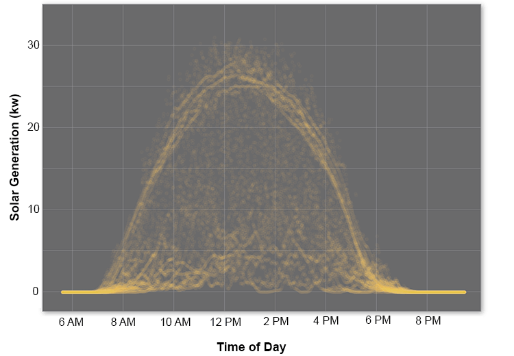
Each frame of the GIF below shows one month of solar generation, highlighting the cyclical nature of electricity production at our solar panels as conditions change throughout the year.
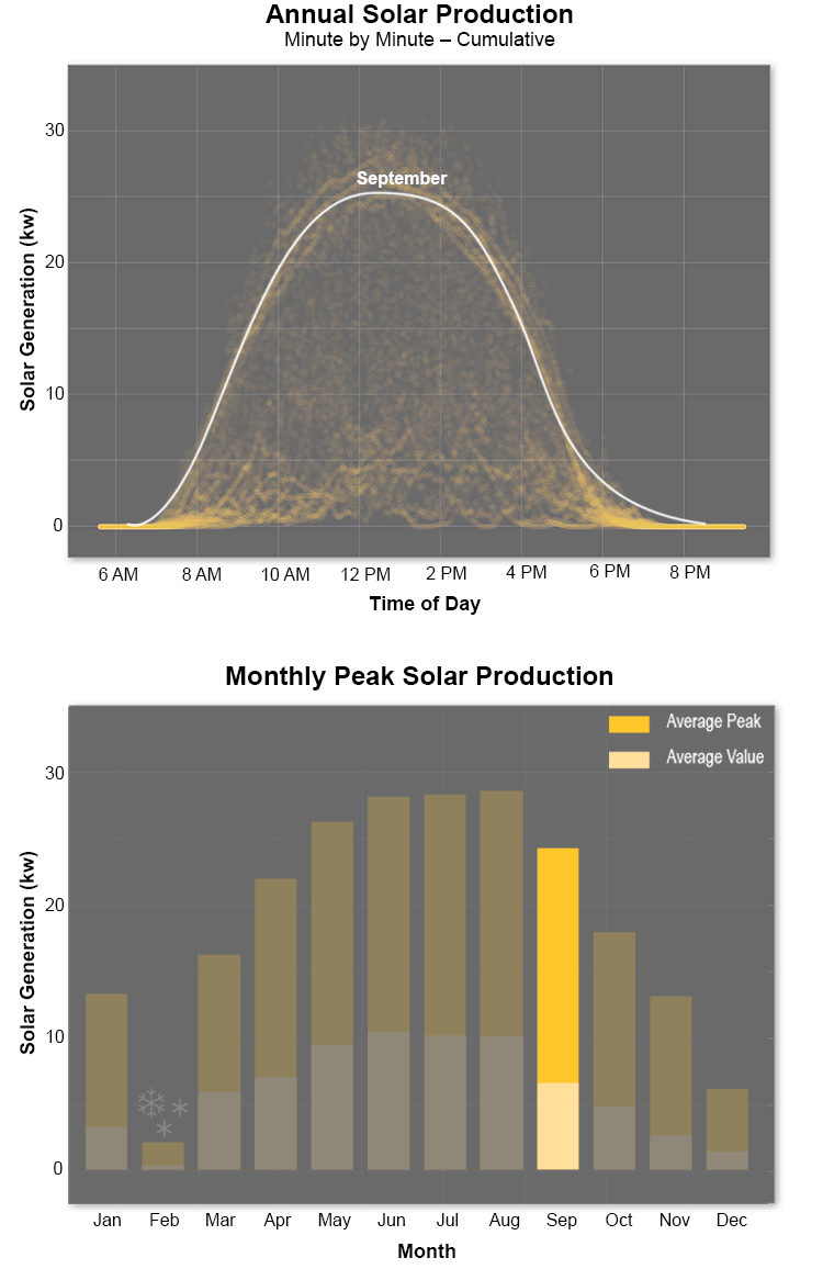
The graph below breaks down the cycle of electricity generation at our solar panels, showing the cumulative spread of data throughout the year, and distinguishing changes in average solar generation month by month.
Several months before creating these GIFs, I found an online tutorial on animation with Photoshop. Out of curiosity, I tried creating my own GIF. When it came time to analyze this solar data and present my findings, it was rewarding to find an application for my new animation skills.